Friday, June 22, 2012

Jerry Sandusky Guilty....Quick Pencil Sketch!!

Well the verdict is in, and Jerry Sandusky is found guilty on 45 of the 48 counts that were against him...Looks like he's heading for prison.

With that said, he has one of those faces that are perfect for caricature, so I had draw him. This sketch took me about 5 minutes or so!!

As far as the conviction goes let me hear your thoughts on this subject. How do you feel knowing this type of predator is out there possibly targeting your child? What would you do if it was your child this happend to? Let me here your thoughts!

Logo creation walk threw...Watch the animation, and see it come to life!

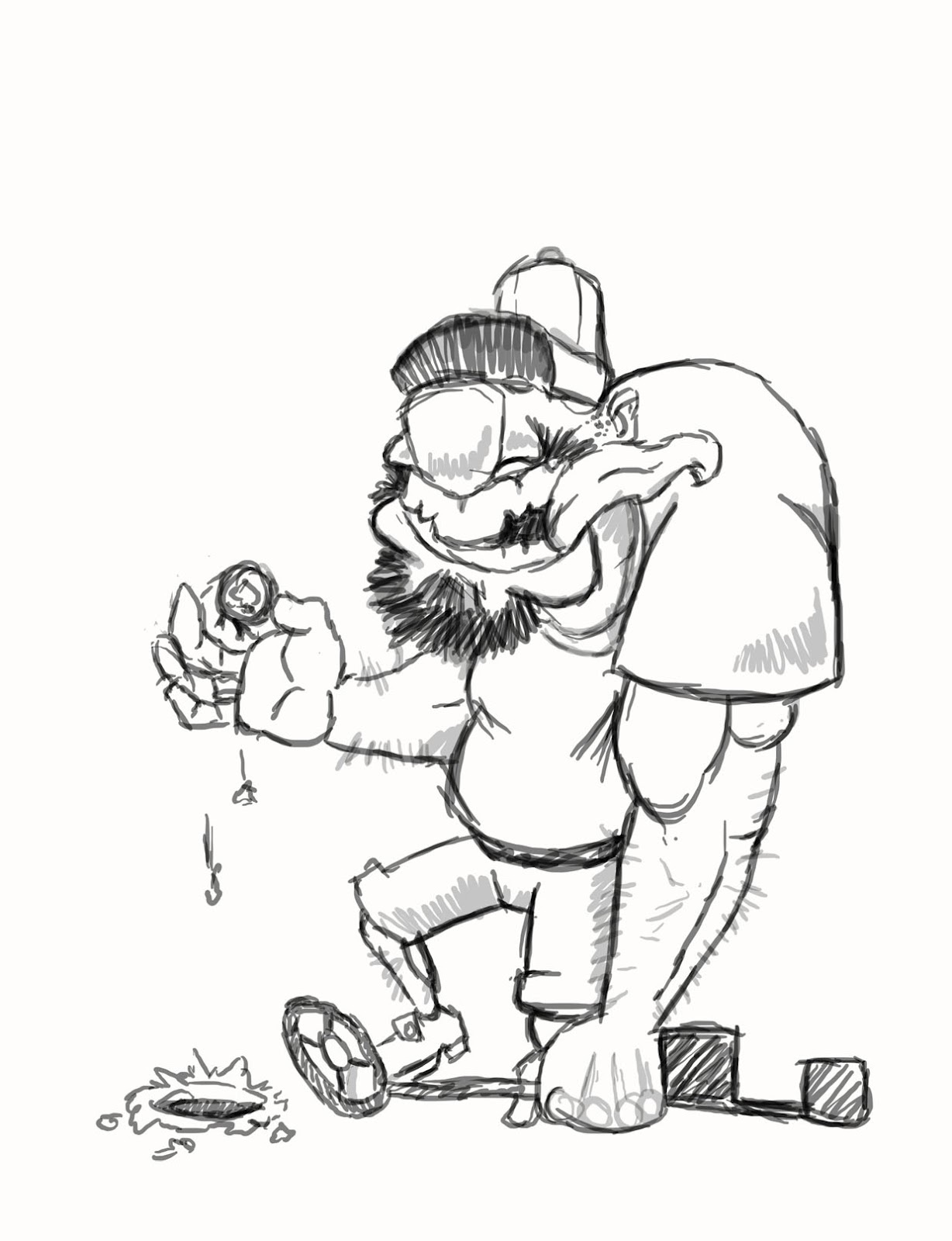
Yesterday, I showed everyone the inked version of the metal detecting logo that I created for recent client. Here is a link to his site! Vertex Airsoft   So I went for a different approach this time and created a animation to show you how a create this type of logo in stages. 
The first step is to perpare the ink drawing for color. Next I color my image using just standard base colors like blue, green, white, gray....you get the idea!!

The second step is to add the shadows to the image. The shadows color are determined by the base color that I used to color the image. For example: on the shirt, the base color is green, so the shadows on the shirt will be a darker green. *How dark the green should be really depends on the artist's taste

After placing all of the shadows, its time for the highligts. Highlights are place on the cartoon where I think sunlight would hit the figure if he was real. Typically I use the color white for the highlights, but the exception is on the shirt. The highlights on the shirt are actually a brighter green. I felt the white over powered the green making the cartoon look funny.

Lastly, to finish off the logo, I created a simple patch of grass underneath him. The more I looked at it, the more I new something was missing. That's when I said " Duhhh Fred...he's just standing in mid air " and so the grass patch was create to give him stability!

I hope you enjoyed the animation, if you have question, or comments, feel free to post them love to here what you have to say. Also if you need a custom logo of your own don't hesitate to ask!

Thursday, June 21, 2012

My Own Logo Got Me A Job!!

The last time I posted, I was in finishing up a metal detecting logo for myself which I called the "Monster Coin Hunter." Well as luck would have it, that logo found its way to a company in Texas called Vertex AirSoft (check it out already...would ya!!)

 The owner sent me an email asking if I would sell the logo for his metal detecting business.... In case your wondering I didn't sell it, but instead made a new one! I kept the overall design very simular to the first one by exagerating some of the features to giving it that RatFink kind of look.

So I have decided to post this design process again. The reason I'm blogging about this subject again is due to that I used a different software program to create this logo. The first one I used a combination of Adobe Illustrator, and Adobe Photoshop to create it. This time I only used AI ( Adobe Illustrator ) for the whole thing. With that said check out the original ink drawing that I did.

Also, If you would like to take a sneak peek at what the finished logo looks like you can see it here.  http://www.fredkocebadesign.weebly.com/ The website is still in construction, but the image is on there in the logo tab...

Thursday, June 7, 2012

Metal Detecting Logo....Finished!!

Well here ya go, stage three is complete! I have added all the color to the logo that I going to add.
In my own personal opinion, I couldn't ask for a better out come.

I threw in the baby blue back drop ( say that three times fast!!! ) and the ground to give the logo more depth. Lastly, the green " Monster Coin Hunter " title finishes it all off!

One more step to do, and that is to have this bad boy placed on a t-shirt.

I'll be showing that tomorrow, so be sure to check back in!

Wednesday, June 6, 2012

Metal Detecting Logo....Color added, but not finished yet!!

Hey, Hey, Hey....Here it is, not completely colored just yet, but it has the base colors and a little bit of shading! Still the image is starting to come alive and as an artist this is where all of your hard work pays off when you see the final image end in sight!!

I will be definitely working on more of this later today, and might possibly post again later on showing how much more of it I have completed.

It all depends, I have a lot of work on my plate right now you'll just have to check back later and see!! 

Tuesday, June 5, 2012

Metal Detecting Logo.... Stage 2 Inked Image!!

As promised, here is the inked image from the original pencil sketch that I posted yesterday. This completes stage 2 of the 4. Here are the stages again just as a reference.

1. Pencil Sketch
2. Inked drawing
3. Color stage
4. finished image on T-shirt

I actually inked this image the old school way and used pen and ink on paper. Most illustrators today tend to do this digitally using software like Adobe Photoshop, Corel Painter, and ArtRage. Any of these programs will give you result like I have shown here. The only reason I tend to ink with pen and ink is due to the fact, if I ever become famous for my artwork then I have originals that could be worth some big money...Well that's the plan anyways!!

Come back tomorrow and see how I add color to this logo.

Monday, June 4, 2012

Metal Detecting Logo.. Monster Coin Hunter

It's been a long time since I posted....Sorry about that! Well I'm kickin' things off with a logo that I am designing for my new hobby... METAL DETECTING!!

So here we are at the first stage which for me is just a general pencil sketch of the idea in my head. *If your wondering why the figure is so weird looking, its because I'm going call myself the "Monster Coin Hunter". The key word here is "Monster"

This will be a four stage process. They go in this order.
1. The rough sketch
2. Inking
3. Color
4. Printed on the t-shirt

Stay tooned because step 2 is coming up tomorrow!!